PsychosisPC:
I’ve been kind of slow to get over here, been lurking for a bit occasionally here and there, but I’ve seen plenty of Xander’s work and decided I should get on this forum and do a bit of posting.
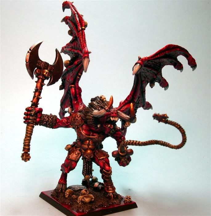
My introduction to you if you don’t know my work: My Khorne Demonic Legion army debuted at the Chicago GT and over the next couple of weeks or so I’ll be showing many pics of the army. Here is a link to GW’s website coverage of my army.
http://www.games-workshop.com/gws/content/…1100004&start=4
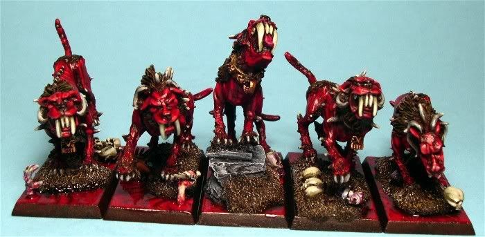
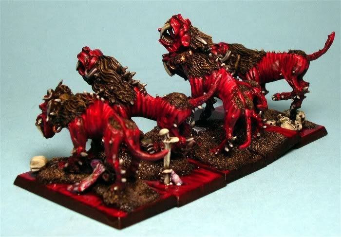
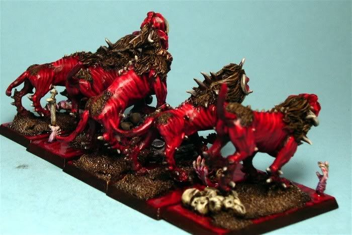
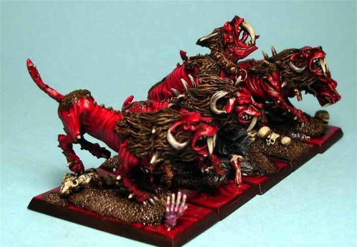
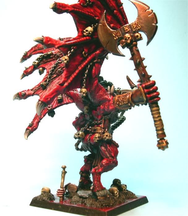
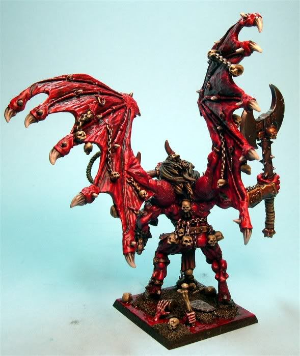
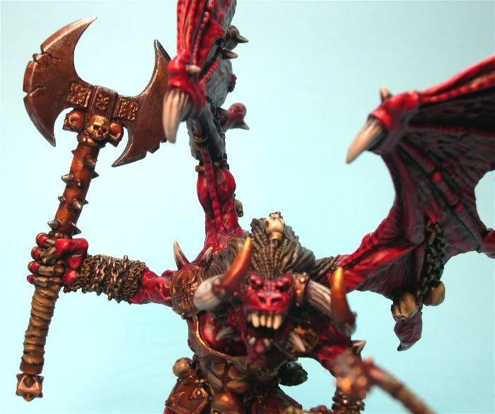
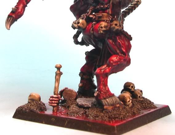
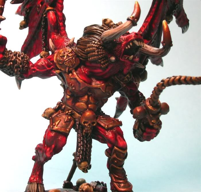
I think the debut was successful as the army took Best Army Appearance probably just narrowly edging out Mike Butcher’s horde of Nurgle Demons, that took Player’s Choice. I decided early on to go with a very strong traditional reds khorne theme with a strong idea of how to base them. I really wanted to steer clear of lava bases as I have seen that do so often, and have had this theme in my head since I built my Khorne beastmen. That was back when you could mix beasts, mortals, and demons. I always had the intention of combining all of the stuff, but in order to differentiate the demons I would take the normal ground basing that my beastmen used but crack the earth and have deep pools of blood with demonic hands reaching up dragging things under to the bowels of hell. I also wanted the blood pools to look very wet and viscous so that people would not assume it was just poorly painted lava. Since I can no longer really combine things I changed up the colors a bit, but kept the blood and demonic aspects.
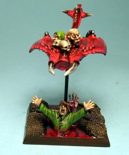
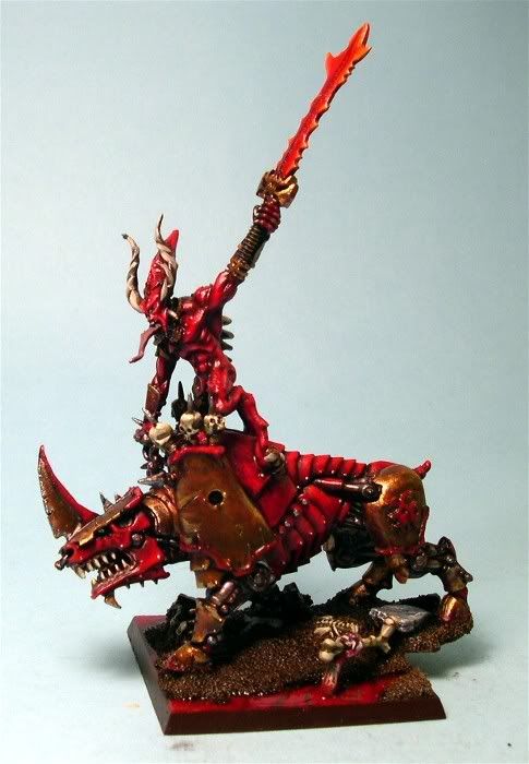
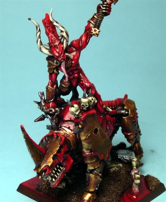
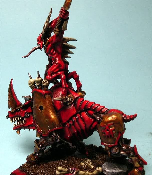
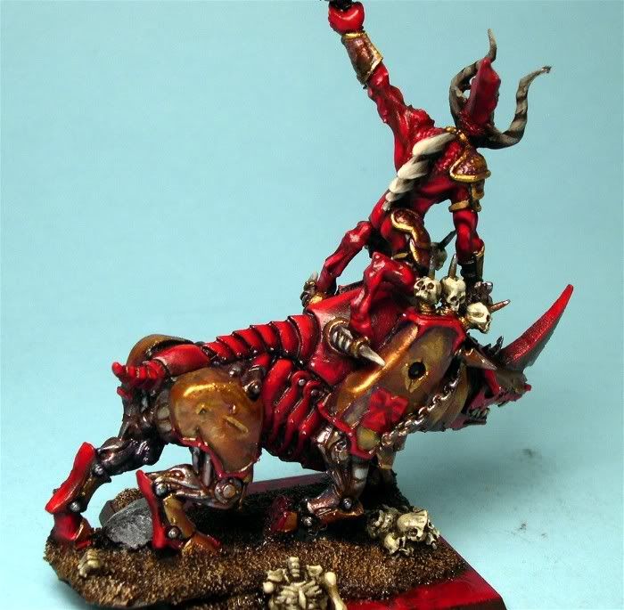
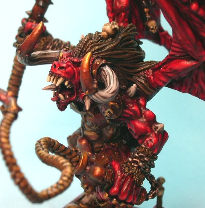
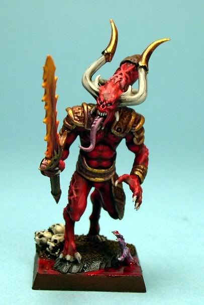
To start out I did up this test piece, in order to iron out the paint colors and schemes that I wanted to use. It turned out well so I entered it in the Chicago Golden Demons, thinking it might make first cut. It did make first cut in a pretty deep Fantasy Singles category, I think the free-hand took as much time to paint as the entire figure did, but I was pretty happy with it considering how small it is. More on the bloodletters later, as to the many changes I made on them model wise: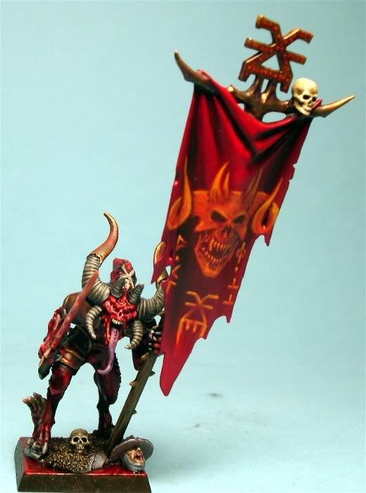
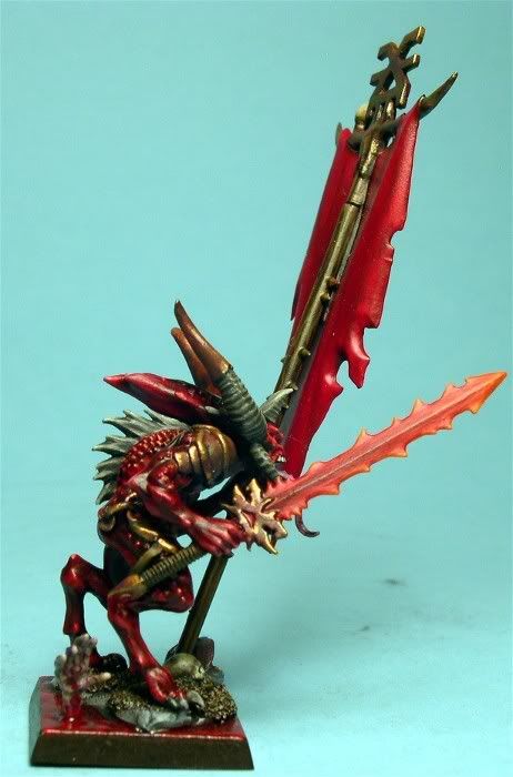
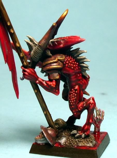
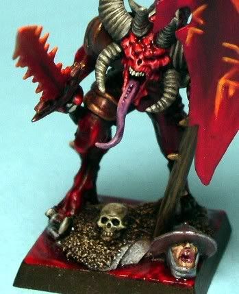
I played around with the basing for the blood pools a bit, experimenting with various varnishes and clears, using a dead flat clear that I hit the models with normally from Krylon, using satin clears from Vallejo and Golden, gloss clears from Vallejo and Liquitex, and then satin and gloss poly-urethanes from Minwax. In the end I settled on the polyurethane from Minwax to get a sense of depth. I’ve heard various people say they don’t like that, but it certainly does add a depth to the pools, compared to the other finishes that I tried. I think they mostly object to the glossiness, but I think that helps get across the wet feeling of flowing blood.
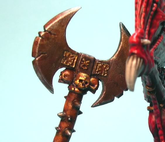
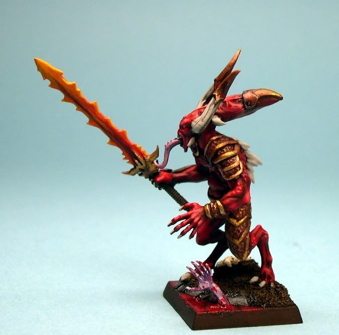
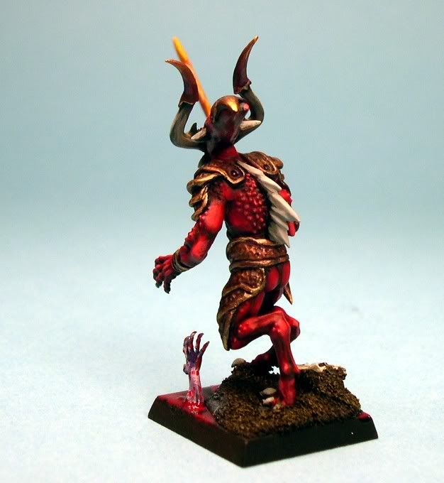
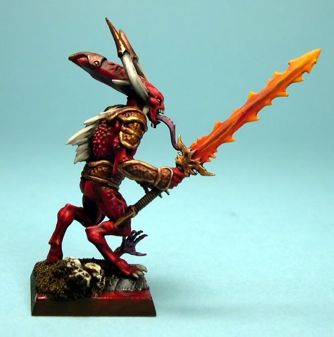
The reds if anyone is interested are based over a black primer, then using Vallejo Model Color Hull Red for the base, GW Scab Red, Reaper Master Series Blood Red Triad, and then mixing a bit of a bone white with the RMS Blood Red to get a redish pink highlight. I’m particularly pleased also with the way all of the armor plating turned out which you can see in the test piece for the army.
The other thing to note is, this is an extremely dark army, I always struggle painting armies red because if you add white to the highlights they become pink, and yellows and oranges make the reds become more orange. So I made a conscious effort to really control those highlights and tried to play with the overall depth of the darker reds. I think it worked, and it certainly helped displaying the army under the brightest lights in the hall so it didn’t disappear. Everything is much darker when you see it in person.
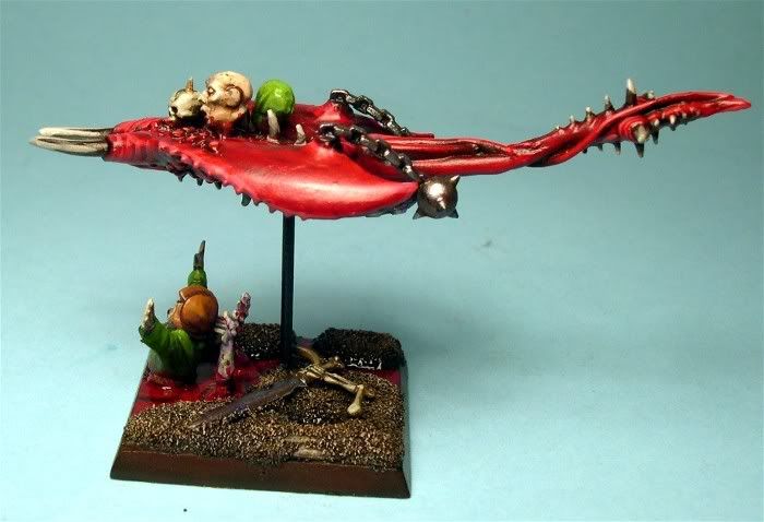
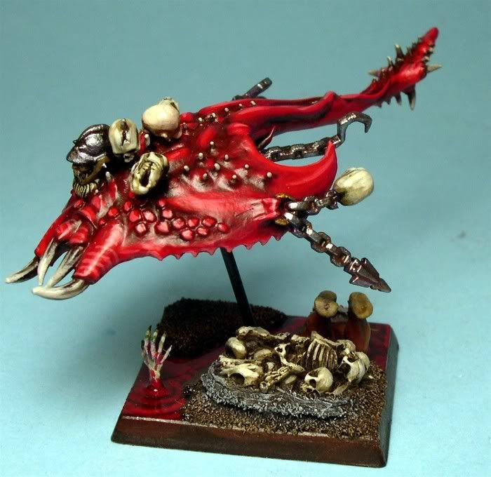
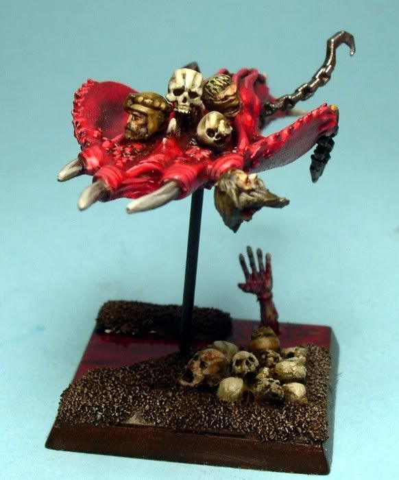
More to follow soon. Next up the Core of the Legion: Bloodletters, along with some flesh-hounds.
—PPC